We might believe that apart from maps, picturization doesn't work for complex, technical, scientific or otherwise
dry domains. However pictures can be created to represent most domains and 1000words.js can help.
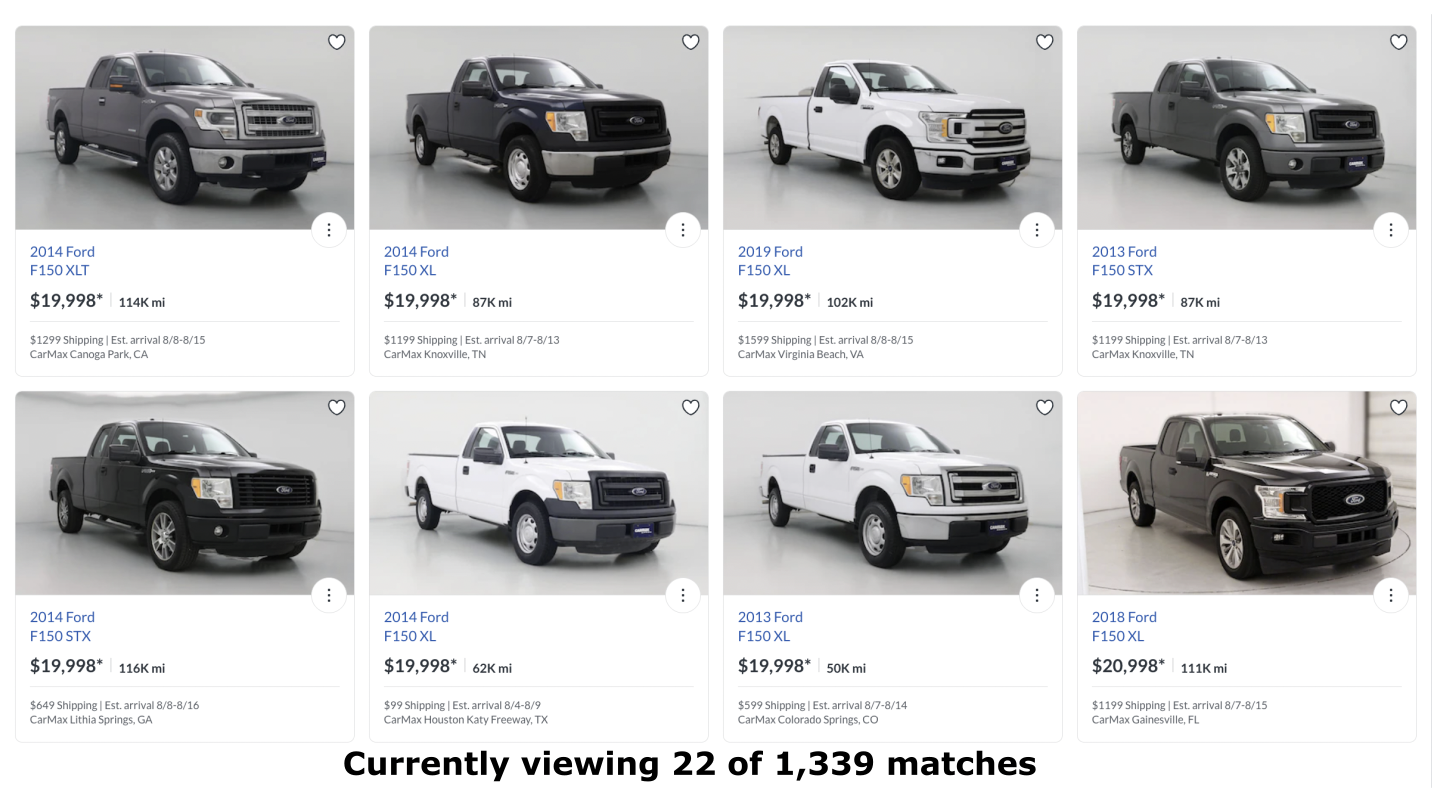
An app for buying used cars seems difficult to visualize as a picture, at first.
Too many long lists - by price, mileage, model year and trim (ascending
/ descending)
How does the 13th car I like on the 5th mileage descending page relate to the 7th car on the
15th price ascending page or 4 others on various lists?
How can I get a feel for the entire set of cars and quickly narrow down from there?
A good picture requires effective use of shapes, sizes, colors and positions
Different Shapes. All F150s have the same shape so this doesn't work ❌
Different Sizes. All F150s are about the same size, so.. ❌
Different Colors. Can be confusing to get creative with colors when each car already has its own color ❌
Meaningful Positions? Last hope.
One possible solution
Map cars out based on the two most important aspects, price and mileage
Uses should see a roughly top-left to bottom-right distribution
Incorporate new model years and higher trims via special highlighting
Price, Mileage, newer Model Years and High Trims, are all visible at once
Users can focus in on one or more areas of interest with one easy swipe to zoom in
The contextual relationship between cars is easily understood based on where they are located